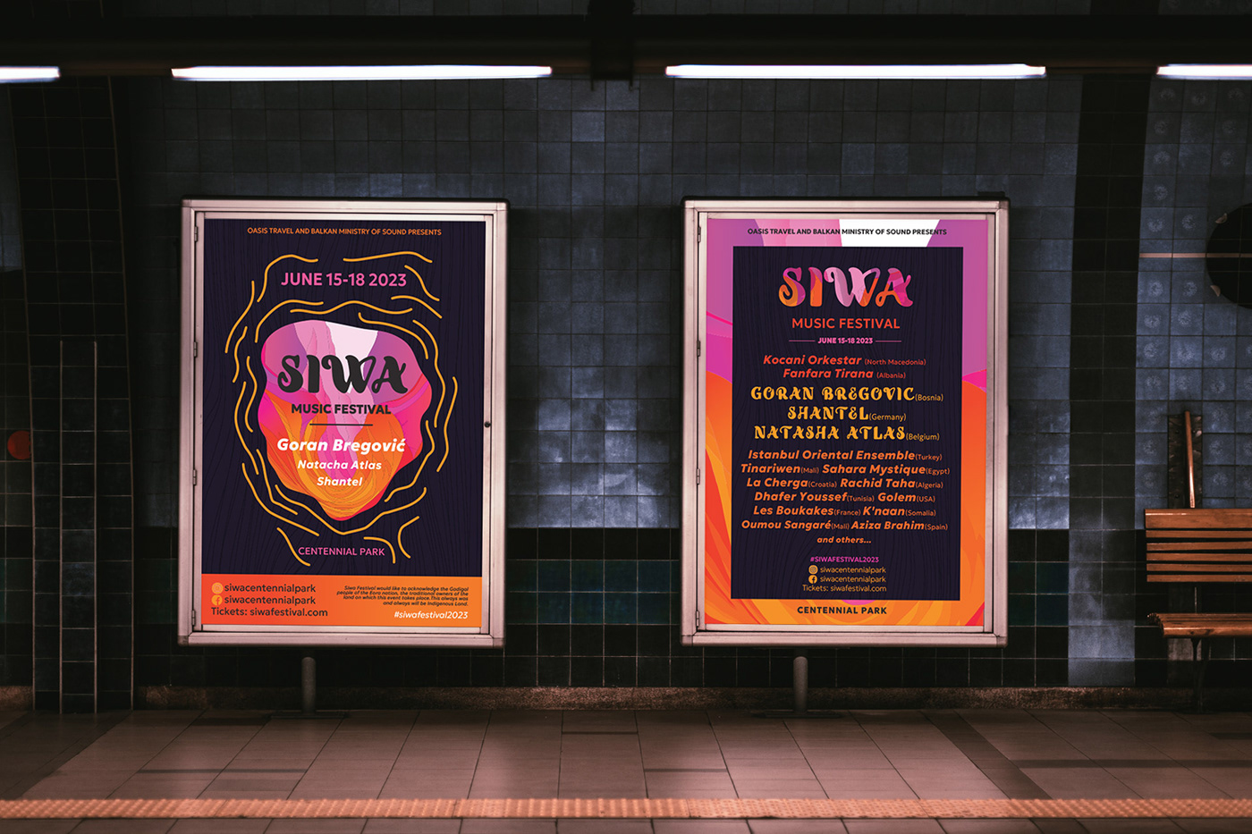
SIWA is a world music festival that combines music from different countries, nations and cultures. Being in Australia I miss eastern European\gypsy and Arabic music, so I created this concept to reflect on that.
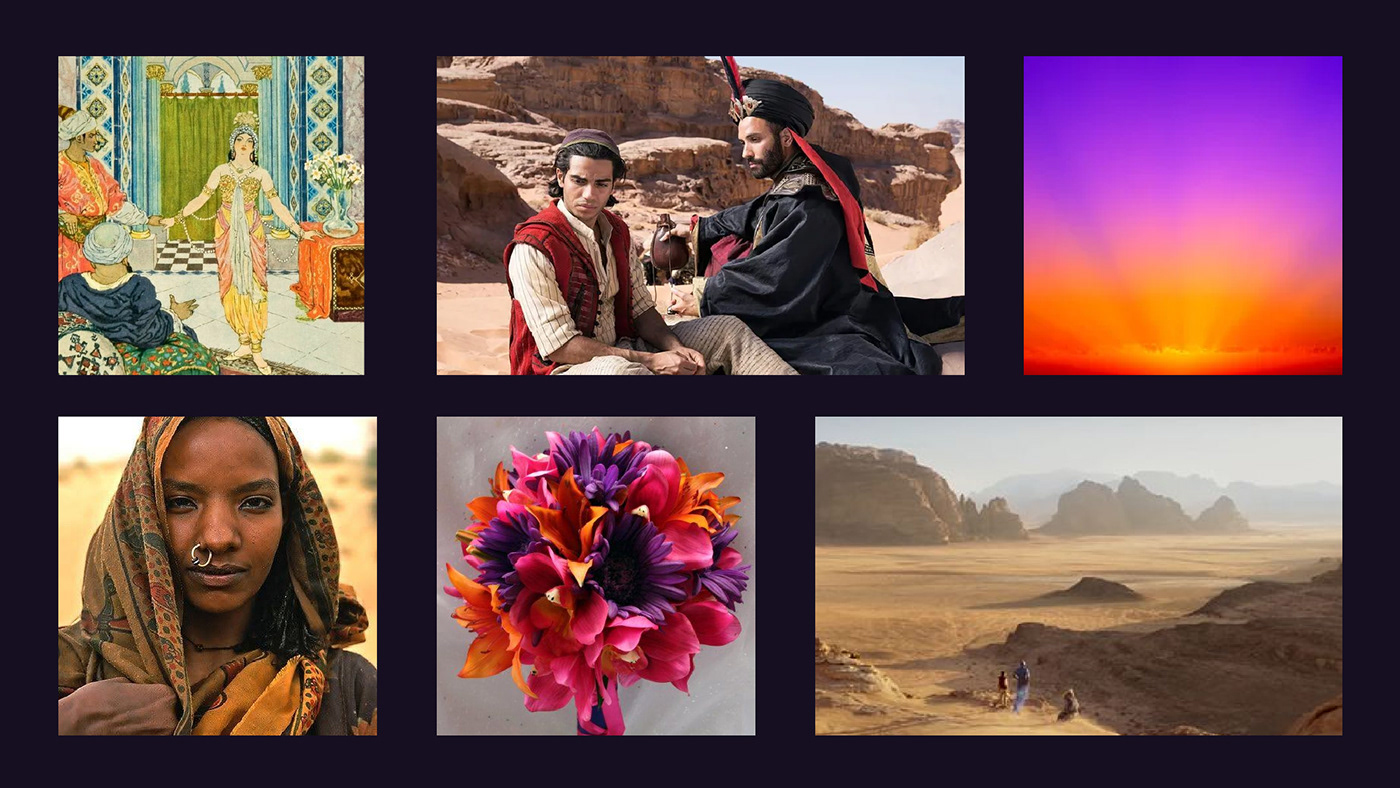
Inspired by desert aesthetics, the Berbers, Aladdin, 1000 and one night it was natural to choose the idea of magical East. Name Siwa refers to beautiful city in Ancient Egypt that known to be a hub for Berber community. Music from this region is naturally infused with dream of travels, nomads and adventures.
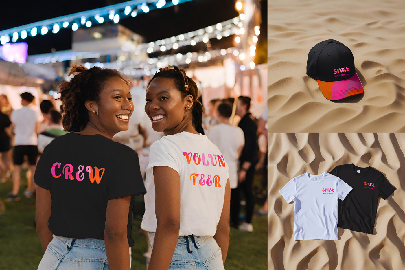
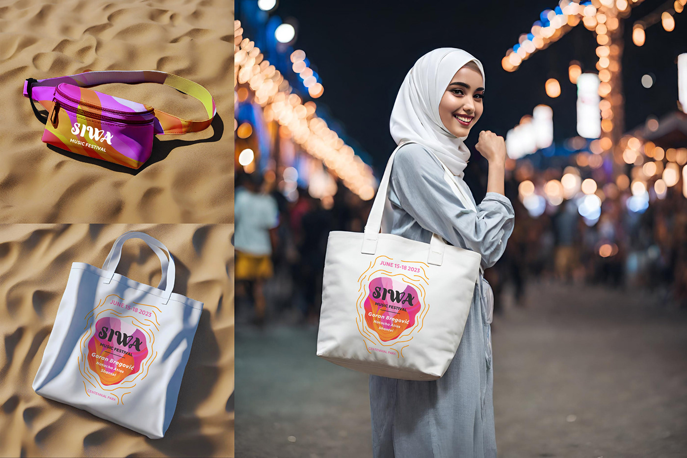
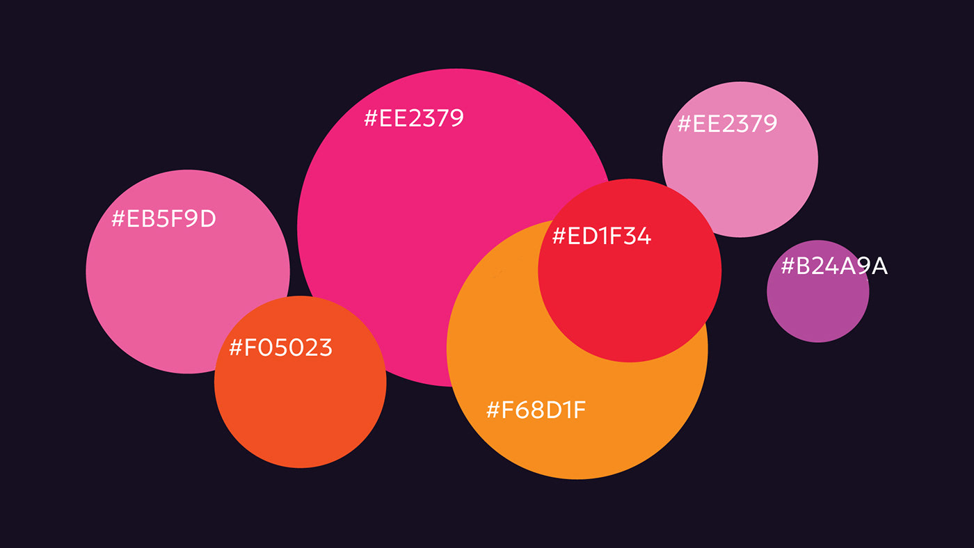
Colours are meant to be bright but not bold. It was agreed on combo of orange, purple and berry pink not only because together they are incredibly vibrant but also because contrast of cold and warm is widely used for creating mystical and magical atmosphere which is perfect for our festival. Also orange\pink reminds of sunset and purple - of twilight.
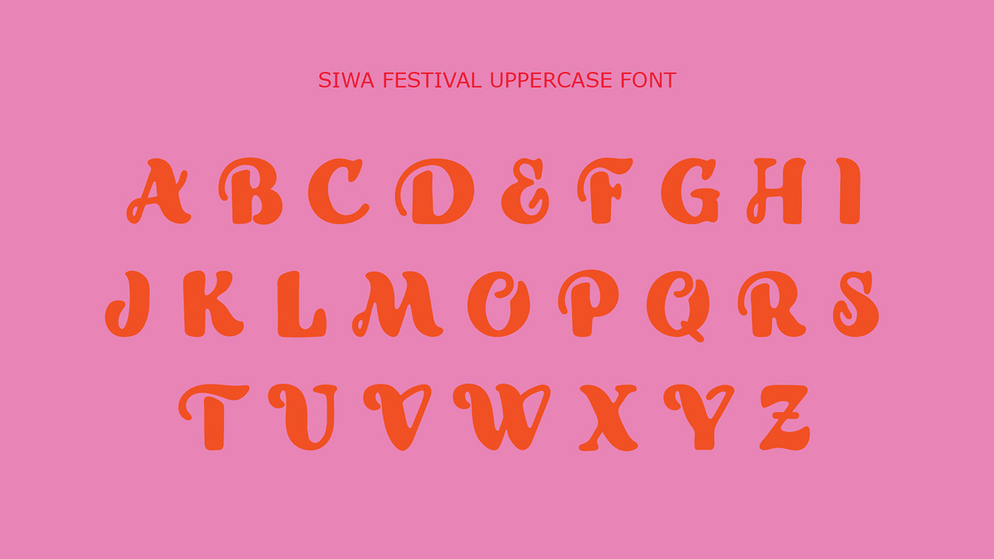
The logotype concept was decided to be expanded to typerface due to lack of flexibility. As a result letters and final logo changed to serve different purpose, and type Siwa was born.

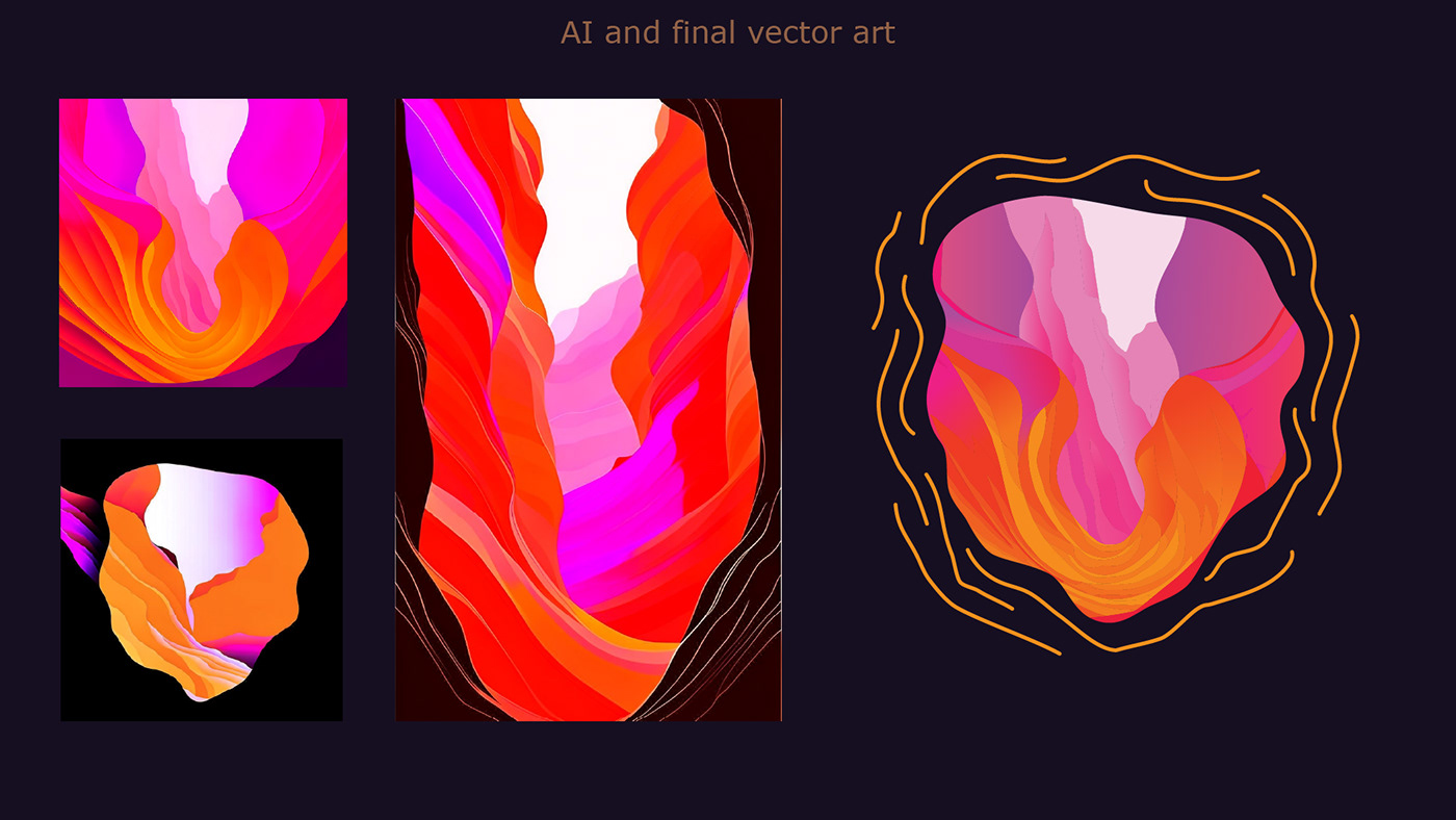
In attempt to incorporate sand into branding we were looking for different aesthetics than Burning Man. Something more slow and mellow, rather natural than industrial. While looking for interesting rock formations we found Antelope Canyon. It has very round edges, that seems magical and psychedelic as well as unique pattern.